Medicann
Medicann
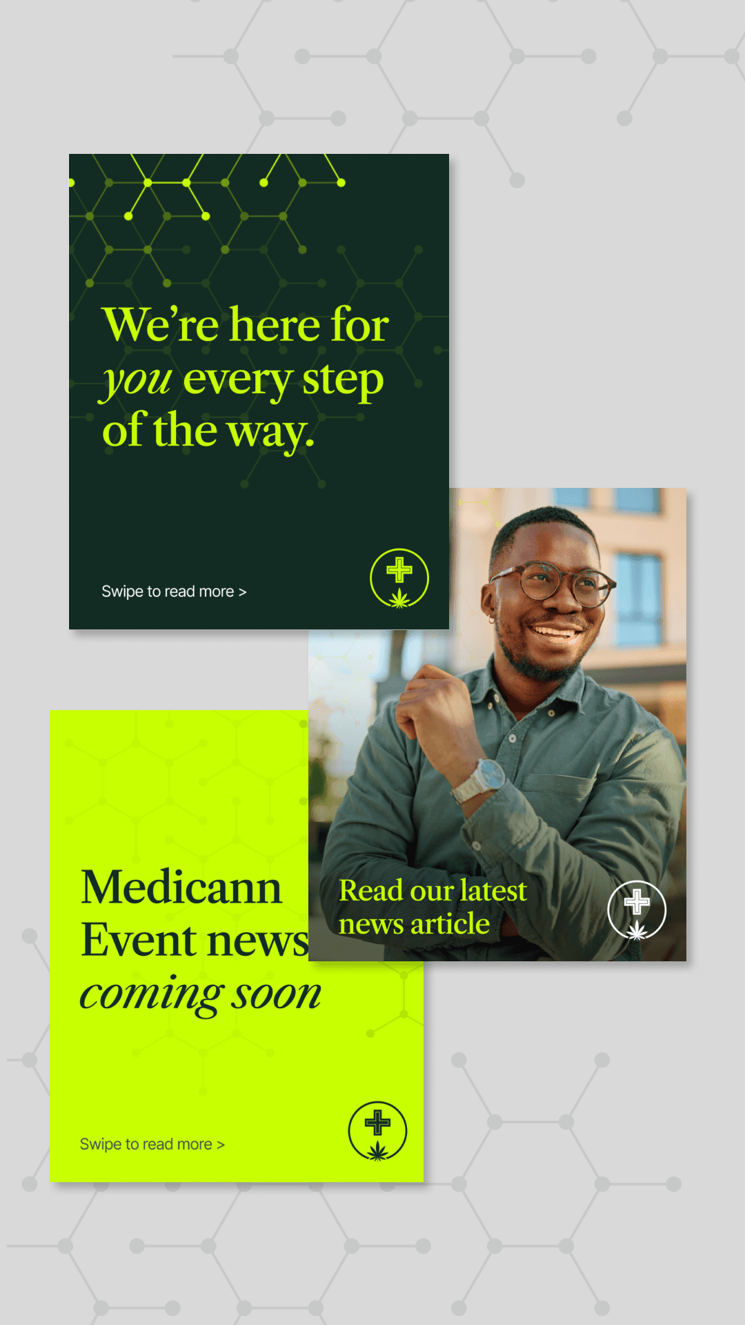
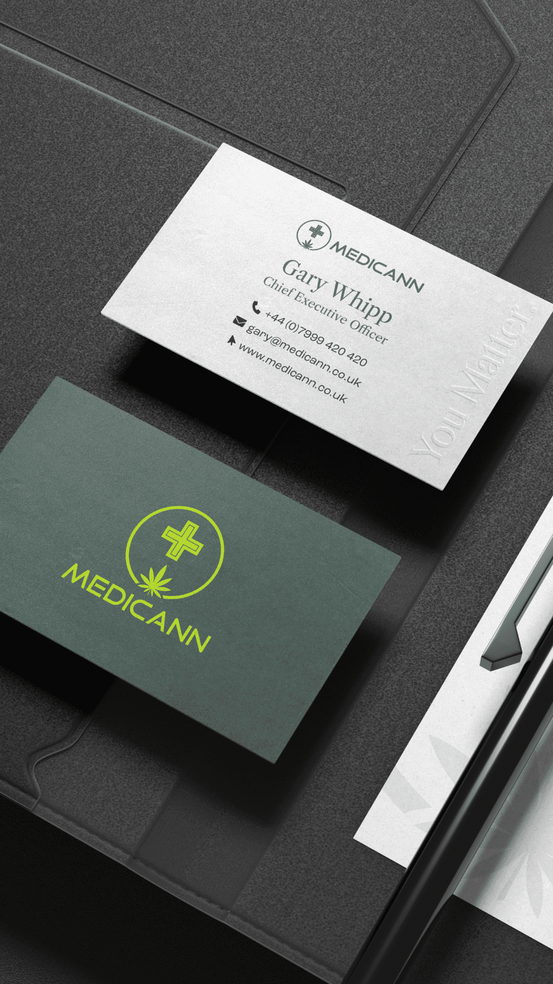
Having worked with Medicann for a number of years, we felt the time was right for a thoughtful brand refresh - an opportunity to evolve the visual identity while staying true to the brand’s core values and recognition. The refresh introduced a refined colour palette designed to bring new energy and warmth to the brand, alongside a new suite of lifestyle imagery that complements the existing iconography and creates a more human, approachable feel. Medicann’s message, “You Matter,” evolved from the original phrase “At Medicann, You Matter,” becoming a stronger, more confident brand asset used more prominently across communications and touchpoints. To further connect the identity to the science behind medicinal cannabis, we introduced molecular-inspired graphic elements throughout the brand system - subtly reinforcing the research, care and innovation at the heart of Medicann. We also revisited the brand’s typography, photography direction and social media presence, creating a more cohesive and contemporary visual language that gives the brand a renewed sense of life and relevance.
Year
2026
Client
Medicann
Service
Branding
Location
Jersey


Next
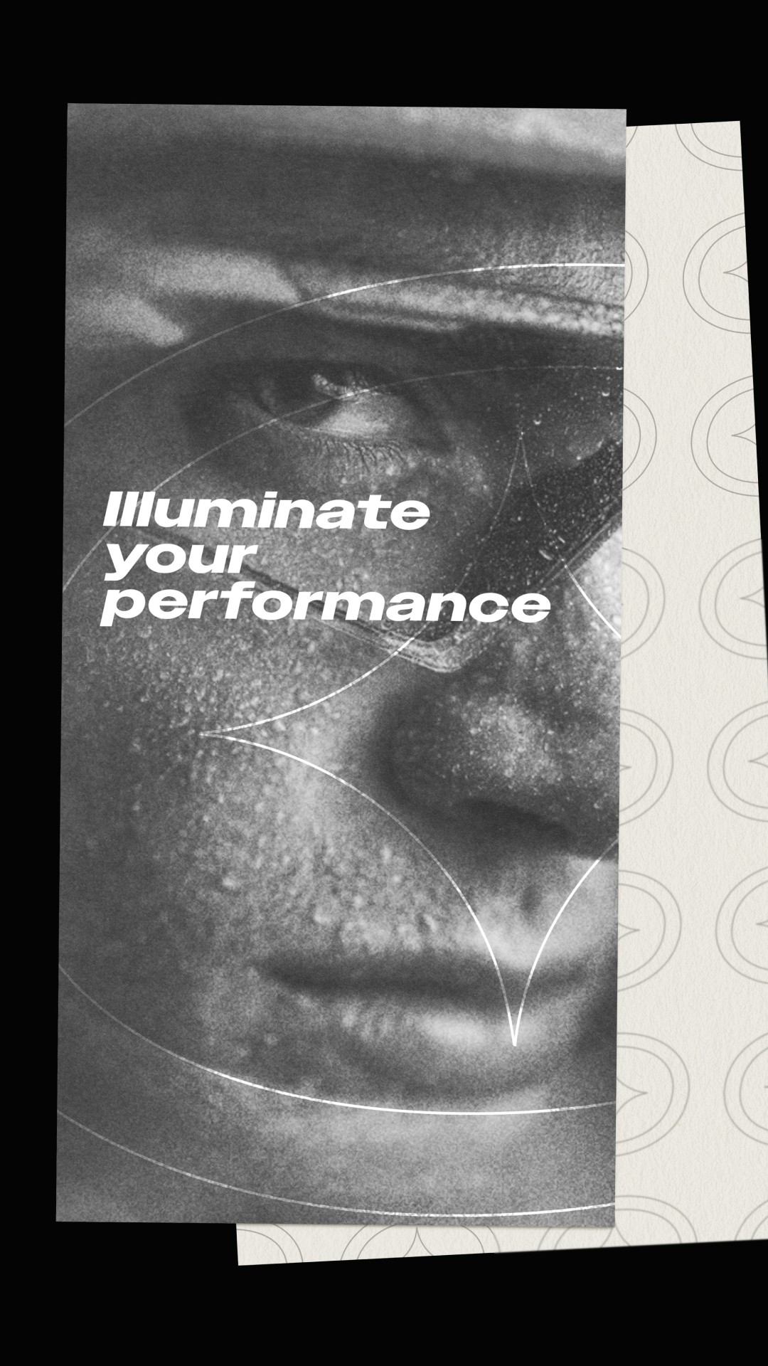
LiteBeam creates lightweight athletic performance garments designed for cyclists who ride in every condition, from early morning training sessions and fast-paced city commutes to long-distance rides through unpredictable weather. The brand is built around movement, visibility and endurance, creating apparel that performs as hard as the athletes wearing it. The identity was designed to reflect that same sense of energy and performance. I developed a bold visual system that gives the brand strong shelf presence and instant recognition, helping LiteBeam stand apart within a highly competitive sportswear market. At the heart of the refresh was a vibrant, high-visibility colour palette inspired by speed, motion and low-light riding conditions. The colours were carefully selected not only to create visual impact, but also to reinforce the brand’s connection to safety, visibility and confidence on the road. The identity combines clean typography, dynamic layouts and modern graphic elements to create a contemporary and athletic feel across every touchpoint. The result is a brand that feels lightweight yet powerful balancing technical performance with a sharp, modern aesthetic. From packaging and apparel applications through to digital content and social media, the refreshed identity gives LiteBeam a cohesive and recognisable visual language designed to move with the rider and perform across every environment.